Thursday 20 December 2012

Vintage Americana

The second project of this year was also self-initiated. I completed a textiles course during my A-Levels, and this year due to living with fashion students, I wanted to create a project that was illustration/fashion based. I decided I wanted to explore creating prints that could be used repetitively as material for fashion garments. I wanted to keep this project contemporary so I chose the fashion trend; Vintage Americana; for Spring/Summer 12'13. Each individual print is made up of everything American, such as urban signage, vintage cars, American diners and iconic American symbolism. I wanted to keep the colours as vibrant and retro as possible. I created twenty-four geometric prints in total, which can easily be replicated using Photoshop. 

Here are 10 of the final prints;


Here are 6 of the repeated patterns, to show how the print could be used as material;


So my final outcome was to create a LookBook of prints that could be used as material. Here's a few pages from the Look Book;

Front cover;


Example of left page;


Example of opposite page;


Summary;


Back cover;


Monday 17 December 2012

'Birds of a feather, flock together'

So over the summer, I had to draft a self-initiated brief as my first personal project of my third year at university. From previous briefs, I knew I wanted to draw from my own photographs wherever I could, so I decided to base my project on photographs I already had of birds of prey. I started the project quite realistically, to be honest I just wanted to prove that I could still draw, with changing styles over the past couple of years I just wanted to strip it all back to the basics. Here's one of the illustrations;


The project swiftly moved on from this process, as I wanted to play around with pattern and intricate detail within the form of a bird. I enjoyed this way of working so much that I based the entire project around it and created two final pieces, one a hand made canvas, with the image screen-printed onto calico, and the other was individual screen-prints on calico, stitched together (patchwork quilt style). 


This illustration in particular was to represent 'birds of a feather, flock together'. Each bird is a different breed of the falcon family and the branch is to represent the connection between them. 


I also produced illustrations of birds in flight. The final outcome of these illustrations was created to illustrate this poem; 

Birds In Flight
By Anishinaabekwe

The bird flew, in flight,
Flew, flying, the birds cross paths,
In flight, wings touching,
Hearts connect, but must fly away.
Shadows cast, a glimpse of the soul,
Intertwined, a moment,
Snapshot, in a picture,
Connection to a soul,
Soil signifies connection,
But longing, reaching, broken for home.


Thursday 16 August 2012

Summer Project

So for Year Two's Summer Project, we had to choose between a range of given briefs. One brief was to use one word off a given list and explore. So I decided to create a project using the starting point 'play'. Straight away I thought of play, in the sense of play, stop, pause, record and just explored this idea, mainly using shapes, such as triangles and circles in particular. I also wanted to be playful in terms of colour, so I tried to stay away from black as much as I could. Here's some of the illustrations I created;

So this illustration was created based on the word record; which translates as vinyl record. So I used a combination of black acrylic and collaged papers.


This image came about as initally a pause sign, so just the two rectangles, however I didn't know what to do with the image, so I just started to create my own town in the middle using different coloured fine liners and just really enjoyed the freedom within these illustrations. 


I also extended them both using Photoshop;


This illustration came about after numerous 'experiments'. Originally the idea came from a circle, so the record itself is a circle, the centre of the camera is a circle and the numerous shapes within the cassette. I just wanted to see what this illustration would look like on paper, scanned it in and tweeked it on Photoshop.


This illustration was based on the camera in the previous one, I just wanted to play around with different retro colours and repetition. 


Wednesday 18 April 2012

DD2000; Design Product.

Design Product; Investigation, identification and interpretation of the 'product'. It also considers the role and significance of the product in culture and society. The student considers the ways in which people give meaing to products as objects of contemplation or as objects of function. Reference is also made to ecological design and materials sustainability.
- Select and compare/contrast FOUR products by FOUR different comtemporary illustrators, either four childrens' books by different illustrators, or four editorial illustrations by different illustrators or four advertising or four design illustrations (1200 words total)

Childrens' Books

I decided to compare and contrast children's book illustrators due to the fact that my previous brief at university was to write and illustrate a children's book of my own. Therefore I searched numerous illustrators until I found four children's book illustrators whose style appealed to me. I also chose children's books because I wanted to expand my knowledge of this aspect of design due to the fact that I've never explored it before. After looking through many contemporary illustrators, the four which stood out to me the most were;  Oliver Jeffers, Lucy Richards, Laila Hills and Anette Heiberg.

Oliver Jeffers                                   Lucy Richards


Laila Hills                                   Anette Heiberg


Initially I chose these illustrators due to the fact that I admire their work individually even though they all look quite similar. They each have their particular styles, however when comparing them to each other there are some stylistic similarities. I have chosen these illustrations in particular because they all contain characters, either human or animals. I found this to be most appropriate because I'm currently developing a character for my own children's book which I feel needs to be developed. 


Oliver Jeffers is one of few children's book illustrators that I'm familiar with. I admire the fact that he also writes his own books (as he is the only illustrator I've chosen who is both an author and illustrator), I feel this allows him to imagine each scene, creating personalisation to which he can illustrate them beautifully. All his stories spring from sense of humour and random situations and his illustrations are just as loose and quirky. Jeffers' characters are drawn with a minimalist approach, yet you still feel emotion through the composition and movements of the characters. Facial features are rather plain which adds a simplicity which I feel is part of the attraction. The rest of Jeffer's artwork can also be seen as childlike, because he uses minimal details to illustrate, particularly with the characters. In most of his books Jeffers restricts himself mainly to watercolours, working into a plain white background, which adds a border and also to his style. I think his use of watercolour techniques capture the scene and characters beautifully and through exploration each of his books are unique in their own way. I feel Jeffers particularly experimented within 'The Incredible Book Eating Boy'. In this book there's a lot of collage, with drawings made onto all sorts of paper which I find most interesting as it relates to my own style. What sets Jeffers apart from other illustrators that I've chosen is that he's extended his work beyond just picture books. Due to changing technologies, many of his stories have been turned into animated films and interactive picture books, where Jeffers' illustrations are brought to life, which I think captivates and engages the child reader. I also feel that by producing his stories in different formats, he can sell his product to a wide variety of young and older children. 


Another author that I know of who has also adapted to the change in technology is Julia Donaldson. In this review I've chosen Lucy Richards (who has illustrated some of Julia Donaldsons' books alongside Axel Sheffler, Nick Sharratt and Lydia Monks), as I feel her paint studies really capture characterisation and her vibrant colours attract the audience. In the same sense as Oliver Jeffers, her characters are quite minimalist when it comes to detail. However I feel even though she only uses loose drawing techniques, the facial features within her work (also like Oliver Jeffers' characters) add personalities to the studies and even a small detail such as a smile can achieve an emotion within the character, which I feel a child would relate to. I also feel the movement and positioning of her characters are quite playful which is relevant to the format of her work. Lucy Richards has some similarites to Oliver Jeffers also including the media she works with. Even though Richards' restricts herself to using mainly watercolour and acrylic, her vibrant studies of natural environments and characters are beautiful to look at and I believe they would attract the targeted audience as well as be admired by older readers. One strength I found within Lucy Richards work when compared to Oliver Jeffers is that she creates an entire scene quite realistically, whereas Jeffers' studies are minimal in the sense of detail. However I believe that both styles are unique to both illustrators. 


Laila Hills is a UK based illustrator, whose background in graphic design helped develop her love for characters and children's book illustration. I feel her work is rather similar to the studies of Lucy Richards, particularly when regarding colour schemes. Laila Hills uses vibrant colours within her work which I feel are playful and eye catching for the child reader. It was also her playfulness within her quirky drawings of animals that I found most appealing. I was particularly attracted to the off-set proportions of her characters features, which sets her apart from the previous two illustrators. Even though Laila Hills is also quite minimalist when it comes to shapes, I feel the colours are the focus of her work and not only are they used to make the study attractive but they also set the scene. When compared to Jeffers and Richards, Hills also uses minimal facial features, however each illustrator captures emotion within their characters. Hills in particular captures emotion within the eyes of the characters, whereas Jeffers and Richards mainly use the mouth to create different emotions. This is an aspect that I want to achieve within my own children's book, and due to this brief being a whole new experience for me, I think by exploring these illustrators I can also adapt my own style and characters to create more personality.


My fourth and final children's book illustrator is Anette Heiberg. Firstly, when compared to Jeffers, Richards and Hills, Anette Heiberg also relys on colour to create her studies, which I think work quite successfully. She also uses minimalist facial features, which are similar to that of Eric Hill (Spot The Dog), however I believe that Heiberg needs to rely more on the mouth of the character because it adds more personality (as seen in the third image across). Also like Laila Hills, Heiberg uses colour intead of drawing to set the scene within these illustrations. Even though her studies are rather simple, I believe children of younger ages will be able to recognise what the animals are and this also provides a learning process. Within other illustrations of Heiberg's she also uses collaging techniques, which are cut realistically to create her characters. I feel this adds creativity to her work and sets her apart from the other illustrators. 

Overall I feel there were many similarities between all the illustrators, however their own style of drawing and creating studies set them apart from each other. I believe all the illustrators attract the child reader in numerous ways; mainly due to colour however I feel Oliver Jeffers in particular uses his imagination and sense of humour to engage the reader through his writing as well as his illustrations. However Richards, Hills and Heiberg have vibrant illustrations which are eye catching and attractive, which is appropriate for the format. My own personal feelings have changed towards children's book illustration. After writing and attempting my own book, I feel I have a good foundation to develop my character building, either due to facial features or positioning of characters. The main similarity between my work and my selected illustrators is the use of colour, whether to set the scene or create personality for the character. 

Word Count; 1,269.

Friday 30 March 2012

DD2000; Design Discourse.
Design Discourse; Identifies and develops the student awareness of and skill in the use of language specific to Design research, investigation and design thinking. The theme also introduces an awareness of the distinctions between communication for academic and professional contexts. 
- Review TWO talks by contemporary practitioners based on talks of interiews on the folliwing websites and blogs; diegestalten.tv / ted.com / D&AD blog / AOI blog / aiga.org / itsnicethat.com / thisiscolossal.com.

Shepard Fairey
'Obey To The Better'


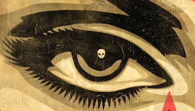
I've admired Shepard Fairey's work ever since I was introduced to it a couple of years ago, and when I saw this interview on Gestalten.tv, I just had to review it. Frank Shepard Fairey is an American contemporary graphic designer and illustrator whose work has been seen all over the world. He's one of the best known and most influential street artists, alongside Banksy. His work has been included in galleries all over the world, the most recent being in Copenhagen. Since the mid 1980's he has created outstanding art that is strong, iconic and expressive. However within this interview you also learn that Fairey is a thoughtful, commited and outspoken activist who revives the artistic virtues of standing up for the freedom of speech.  


Fairey starts the interview by explaining the thoughts behind the creation of his work. His opening speech describes how the focus of society is control and power, and what matters most to him is what you can do to shift that focus. He explains how it doesn't matter whether someone doesn't like a particular piece or his work in general, as long as he alters the way people think.


Fairey characterises his style as attempting to engage people outside of the usual, narrow elite fine art world. He looks at modern culture as being full of mass communication that can be very overwhelming, which influenced the fact that he thinks art really needs to function as a way to stand out above the clutter of visual noise. The aim behind his creative freedom is to try and make his art both visually arresting and in depth. Throughout his work he uses vibrant and eye-catching imagery to grab the viewers attention, however the image also has some message behind it, either political or social commentary that also provides an overall them of empowerment. 


Fairey continues the interview by explaining that he believes if you want to create something that can make a difference, then the street is where you can prove that. He thinks the risk and the passion of the application in that public form really translates to the viewer and it gives a positive affect to the people who have always thought they were powerless in the face of the government. Through this process, creative artists and viewers end up seeing results, so even if they create art as a way to get quick personal fame, the street can turn into a serious area of art democracy and political dialogue. It's the place that artists play in order to be seen and heard. 


Fairey in response to his previous comments, also explains how he's in a law suit with the associated press over the reference photograph he used to illustrate the Obama poster. Fairey explains his feelings about copyright, and I was rather inspired by his comments and how he sees the issue. He explains that copyright is important and as powerful as it always as has been, however he believes it should relate to exact identical copies, not transformative pieces. For decades artists, musicians, speech writers and authors were creating new works that were inspired by older works but somehow updated the conversation and had new and unique value. So he believes that the law suit is worth fighting because any number of artists that have produced important work in the last Century, their entire bodies of work could be considered copyright infringement and the danger behind this is that people will not make that kind of work for fear of being sued. Not only is it an issue important for him as a street and outspoken artist but also for art in general. I personally think Fairey touches upon a strong issue, and depending how far copyright will and can go, it starts to eliminate being inspired by other artists due to the fact that your inspired aspects could also be seen as copyfright infringement. 


Fairey continues to talk about the method and technique behind his creative work, which I found interesting and inspiring. Fairey explains how the computer is a tool, and just a step in the process he uses to create a piece of work. Due to the fact that he started before the computer era, he knows the end results that he wants and he understands the full possiblity and dimensions within hand-made work. Therefore he doesn't feel bound to the limitations of a computer, which makes him very fortunate in that way. 


The main aspect and technique of Shepard Fairey's work is what I admire and am inspired by the most due to the fact that it's something I want to develop and include in my own work. Fairey explains how screen printing allows him to think of what he wants in his head and then explore and experiment with colour and technique until he achieves something close to what he wants. After he has an initial piece he allows himself  very loose and creative freedom to 'go crazy' and do whatever he wants. Screen printing is a very liberating medium, it allows you to be very passionate and realistic in detail, but simply through process allows you to also enjoy what your doing. When compared to computer, even though it still allows you to experiment in an unlimited way, you personally can't be involved due to the playing surface being a screen and not simply open space. 


The main aspect of this interview that I felt I could relate to was when Fairey describes his feelings towards screen printing and why it's an important method for him. Fairey believes that screen printing allows you to create imagery by hand, and this is more personal and organic than digital creation. People will respond to natural hand-made work, even if it's very subtle. There's something in the translation by hand and by screen printing that yelds something idiosyncratic to that artist and screen printing is important to him for that reason. It's also a great tool of reproduction and collage. I couldn't agree more with this aspect of the interview, the reason I'm attracted to Shepard Fairey's work is mainly because of the screen printing elements he uses and it's also something I look forward to experimenting with in future projects. 


Fairey finishes the talk by reflecting on his personality over the past couple of years and how he feels he's become more socially and politically engaged. He explains how for a number of reasons he's always cared about the big concepts such as 'big brother is watching you' and 'make sure the planet is preserved'. It's the ideas behind his creativity and imagery that has always been important to him, even if he only made a little bit of a difference. He also feels he's matured over the years, mainly due to the fact that he now has children and he cares about the world they inherit, it's not just 'live fast, die young'. For the first time in his life, he's been looking at the world a little less selfishly. 


I chose this interview with Shepard Fairey in particular because not only is he an artist that I've similiared myself with before, but he also uses techniques that I find inspiring. I feel the thoughts behind his work make him different in comparison to other illustrators, as he explains in this interview there's a process and a reasoning behind every aspect of imagery. Not only is his work visually beautifully, it also has a purpose, and I think it pushes the boundaries of graphic design and illustration. It's not just about creating images in your own style, it's also about adding your opinion without speech. I also admire the technique behind his work. Due to a contemporary audience, digital composition and creativity has become a lot more advanced and easier to create exactly what you want, and I admire the hand-made quality that Fairey bases his entire body of work on. This is something that I'm definitely experimenting with and wanting to develop within my own studies. 


Shepard Fairey; obeygiant.com

Word Count; 1,375 :)