Showing posts with label typography. Show all posts

Monday, 19 December 2011

Dewey Decimal

Dewey decimal is the numerical organisational classification of books in most libraries. For example; Illustration in the UCLAN Library is classification number 741.


In this brief I was given a random Dewey Decimal classification number (808.5) which referenced a book within the university library. I had to select a book from that classification and base a series of images on it, gradually developing to a final idea which can be printed at A1 size. 


My book was 'News Subediting' which describes to a newcomer of newspaper, the process they would have to go through to create the newspaper. After reading through the book, I found a chapter based on typography and punctuation, and I started sketching straight away. After a long winded process within this brief, I finally got to my final idea and printed it professionally. 


As I was playing around with inspiration and typography, I came across a quote by Salvador Dali 'Intelligence without ambition, is a bird without wings'. Initially I started by creating my own type for this quote, then one sketch of a bird, lead to a sketch of a birdcage, to the point where in order to relate the project back to typography, I decided to make the birdcage itself out of the Salvador Dali quote. I created this image by scanning in the best type of the quote, and then duplicating and arranging the layers to create a birdcage in Photoshop. This piece is on plain brown postage paper, however I decided to add to the background by screen printing vintage floral patterns and repeating them alongside each other to create my own wallpaper. 

This is the main focus of the final piece - 
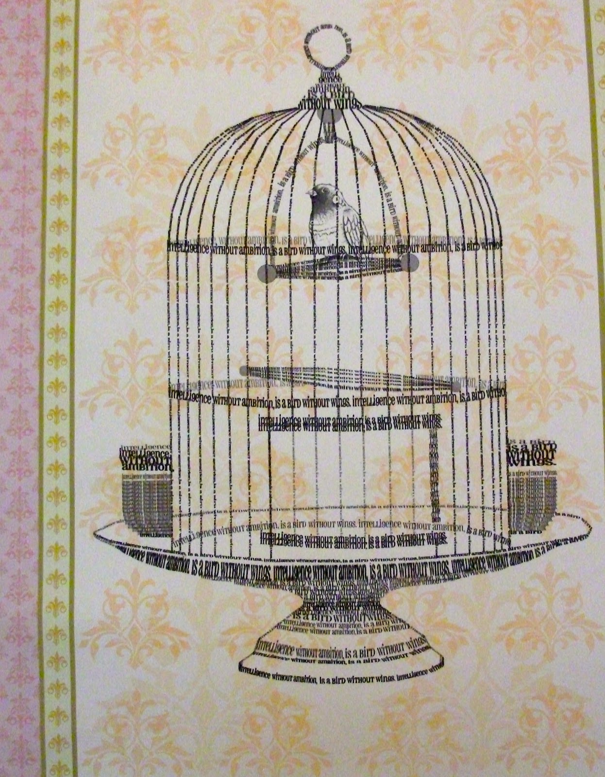

This image is slightly blurred because of my camera, which I had to resort to because the image saved is too big to upload and it won't save on my mac at a smaller resolution. I found due to duplicating the layers and changing the shape of them, the birdcage seems pixelated. If I was to do this project again, I'd aim to make my final piece as hand-made as I could, but at the time of this project, I thought a Photoshop, digital image would be more successful. 


Sunday, 17 July 2011

Elective


At university I chose an elective project to fulfill the first year of my course. Out of a number of briefs, I chose the one that was the most appealing to me which I believed I would be most comfortable in. The brief I chose was to design a tattoo for the first line of the poem Ode. Ode is an 1874 poem written by the English poet Arthur O'Shaughnessy to which the opening line is 'We are the music makers and we are the dreamers of dreams.'  

I was firstly influenced by anything I saw that could relate to this project, however after a few experiments I decided to not take the typical route of drawing something musical or music related. I explored several beginning ideas and then expanded them by selecting the best aspects of different sketches and combining them together. I also played around with different typography due to the fact that certain imagery needed a particular font to suit each other. My personal opinion; I'm not really fond of coloured tattoo's so I decided to keep everything black and white, either in black fine liner or using tonal pencils. I worked mostly within my comfort zone, drawing things that I wouldn't neccessarily draw myself however I kept them of a small proportion and quite detailed. I'm uploading a select few which I believe are the better images from the project so here are my ideas;


A key, shaded in using tonal pencils, with additional floral detail in the background.


A rose, drawn simplistically in black fine liner, some broken lines to give a delicate effect.


A skull attached to butterfly wings, the main outline drawn thicker in black fine liner. I was originally planning to use tonal pencils to finish this sketch, however I just preferred it the way it was.


A skull surrounded by roses, shaded in using tonal pencils. Added leaves for detail.


A flower (shaded in using tonal pencils) and the Ace of Spades. Decorative swirls to added more detail. I saw something like this browsing online and regardless of whether I was going to use it as a final piece, I still wanted to create this anyway.


A peacock, drawn in black fine liner, simplistically drawn with detail in the feathers.


A different styled key, with added wings.


A peacock again, shaded in using tonal pencils, added swirls at the end of the feathers for detail.


A heart, drawn simplistically in black fine liner, added swirls for effect. Kind of a Si Scott moment.


Previous skull and roses, with typography added to suit the image.


Previous rose, with calligraphy style type to give a more delicate effect.


Second peacock, slight change in detail to the end of the feathers (I prefer this way) and typography added to suit the imagery.


Heart again, this time shaded in using tonal pencils, with a calligraphy style type to suit.


Full wings, a tattoo ideally to cover the back. Drawn and shaded in using tonal pencils and the typography was added at the end of the sketch.


Tuesday, 5 July 2011

Type Brief

My response to a brief during first year of university;
Okay, so the whole idea of the brief was we had to create an image of a person or creature using typography which had to be our own initials, in my case JTW. I quite enjoyed this brief, I like experimenting with typography and it was nice to have a brief within my comfort zone. So here's what I created;


Yes, I'm a fan of black fine liner. I think I was also going through a drawing 'peacock' phase. If you see my response to a separate brief around the same time as this one, you'd completely understand. 

My second response;


A different style than my first response, the obvious difference being I created the first image using my initials, where as this sketch I use my initials to fill in aspects. I think I prefer my second response, due to my influence being an illustrator that I've related my work to a couple of times previously. Stina Persson is an illustrator based in Stockholm, Sweden. Her sketches consist of watercolour, acrylic and inks, cut paper and collage and sometimes photo incorporated. I particularly liked the pose within this image and decided to recreate her sketch using my initials for this brief. 

Check out her website! http://www.stinapersson.com/