Monday 19 December 2011

Dewey Decimal

Dewey decimal is the numerical organisational classification of books in most libraries. For example; Illustration in the UCLAN Library is classification number 741.


In this brief I was given a random Dewey Decimal classification number (808.5) which referenced a book within the university library. I had to select a book from that classification and base a series of images on it, gradually developing to a final idea which can be printed at A1 size. 


My book was 'News Subediting' which describes to a newcomer of newspaper, the process they would have to go through to create the newspaper. After reading through the book, I found a chapter based on typography and punctuation, and I started sketching straight away. After a long winded process within this brief, I finally got to my final idea and printed it professionally. 


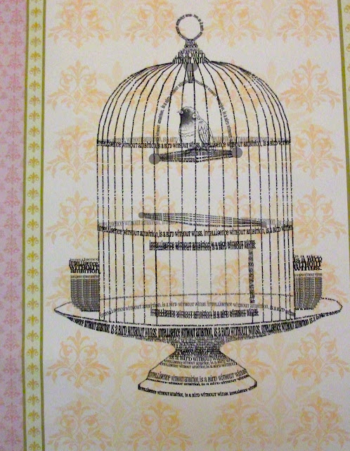
As I was playing around with inspiration and typography, I came across a quote by Salvador Dali 'Intelligence without ambition, is a bird without wings'. Initially I started by creating my own type for this quote, then one sketch of a bird, lead to a sketch of a birdcage, to the point where in order to relate the project back to typography, I decided to make the birdcage itself out of the Salvador Dali quote. I created this image by scanning in the best type of the quote, and then duplicating and arranging the layers to create a birdcage in Photoshop. This piece is on plain brown postage paper, however I decided to add to the background by screen printing vintage floral patterns and repeating them alongside each other to create my own wallpaper. 

This is the main focus of the final piece - 


This image is slightly blurred because of my camera, which I had to resort to because the image saved is too big to upload and it won't save on my mac at a smaller resolution. I found due to duplicating the layers and changing the shape of them, the birdcage seems pixelated. If I was to do this project again, I'd aim to make my final piece as hand-made as I could, but at the time of this project, I thought a Photoshop, digital image would be more successful. 


Thursday 1 December 2011

Issues And Beliefs

The aim of this brief was to choose our own campaign by researching social, political and environmental issues that already exist and addressing one that we personally feel strongly about.

I decided to choose binge drinking to focus my campaign on, even though it's already been done in various ways before. With being surrounded by a student orientated town with a lot of bars offering the same '2 for 1' drinks, I thought I could create a contemporary campaign to target a younger audience.

After numerous sketches and playing around with the idea of drinking glasses, I found that developing a shot glass idea was probably the best way to go, in reference to all the 'free shot' stickers that are handed out around town.

The final composition was to create 3 image based solutions in an appropriate format;


All in poster format; The composition of each poster is to represent an opticians chart, with the usual lettering being replaced by shots, each poster describing a different characteristic of binge drinking. The writing on each poster is to represent the hours of a night out and the destruction of particular things as the night progresses. The type also relates to what the image is describing. The colour spills in each background are to represent spillages of drinks during a night out/party. I chose particular colours to refer to the colours of alcohol available today eg. apple sours. 

Poster 1; Eyesight
- The shot glasses in this poster are to describe the affects alcohol has on your vision. The shot glasses become faded and harder to see as the night progresses to 3am, to represent how blurred your vision goes as a result of drinking. 

Poster 2; Balance
- The shot glasses in this poster are to describe the affects alcohol has on your balance. As the shot glasses move down the poster they become multiplied and 'off-balance' to represent what happens to the stability of a person after drinking.

Poster 3; Consequences
- The shot glasses in this poster are to represent the destruction of a night out and the consequences drinkers have to face, whether it relates to losing money, breaking relationships, violence and disorderly behaviour. The broken shot glasses represent the later on in the night, the more alcohol as an affect to deliver consequences.

I enjoyed this project, literally because I made it my own, after numerous sketches and ideas I'm happy to have developed this one in particular. I took a step out of my comfort zone by becoming more 'accidental' in my backgrounds however if I was to develop my final pieces, I would create them in a more hand-made process, rather than created and then scanned in and pieced together. 


Monday 10 October 2011

Preston Vintage & Craft Fair!

Hi all!

So I took some time out yesterday to visit the Preston Vintage & Craft Fair which my friend invited me too!   After endless trekking around an unfamiliar part of Preston, we finally came to the Continental pub, situated on South Meadow Lane. I think we all shared the same thought when we arrived.. we all felt slightly lost, there wasn't much directional help, so only after asking numerous people we found a small room at the back of a pub full of vintage and retro homewares! 


I have to say, despite the minor detours to actually find the venue and the confusion when we arrived, the experience paid off! The fair itself consisted of about 14 small stalls full of antiques, vintage and independently designed clothing, handmade jewellery, arts and crafts and my favourite part.. cupcakes! Everything was rare, quirky, affordable and antique! In such a friendly atmosphere, it really added to my day and I'm looking forward to the next fair!


I decided to take some photographs to share with you and give you a taste and here they are..


Not to mention.. my quirky friend Danielle who was right at home!


For anyone whose interested.. 

The Continental Pub holds regular fairs and their website is updated with what's on and when..

The organisers for the Vintage & Craft Fair can be found on Facebook by joining the group.. Not Just Vintage.. Uk.

Happy browsing! (:

Friday 7 October 2011


“Being the richest man in the cemetery doesn’t matter to me … Going to bed at night saying we’ve done something wonderful… that’s what matters to me.”
- Steve Jobs.

Friday 16 September 2011

Long time, no blog!

So, the 10th of August was quite a while ago, so I thought my blog has been neglected enough and at least deserves a mini update of what's happening!


So.. the most exciting news at the minute, I am now blogging using my very own MacBook Pro. I've finally been converted and all the saving up as really paid off, money well spent!


I start my Second Year at Uclan officially on tuesday, I'm rather excited to get back into the swing of things, there's only so much time I can have off then safe to say, I do miss my projects. 


Final news.. Currently working on a side project. A lovely lady in Huddersfield has been told about myself, and my work by a friend and she's requested I paint some sketches for her, to be displayed in her Spa. At the moment, I have two sketches drawn out, I need to introduce some watercolour and get the process rolling! And when I've finished, I'll make sure my blog is updated! 


Cup of tea at the ready..
Here's to a productive day!
...

Wednesday 10 August 2011

Wish You Were Where?


Manchester Art Gallery.


I decided to make use of my time and visited Manchester Art Gallery a couple of weeks ago and saw these pictures on my camera and couldn't resist. So the idea of this collection is visitors to the gallery where asked 'wish you were where?' to which they would write a place on a piece of paper and tie it to one of the suitcases in the collection.  There was something so realistic, yet fragile about this exhibition that I was drawn to it.


I added my own onto the birdcage :)


Plus reading each piece of paper was inspiring; children wishing they were in Neverland, and quirky adults that wished they were with loved ones and places or memories from their past.


Artists and celebrities that contributed were; Badly Drawn Boy, Alan Birch, Pavel Buchler, Margaret Cahill, Ben Cook, Michael Craig-Martin, Nick Crowe, Mike Chavez-Dawson, Matthew Dalziel and Louis Scullion, Phil Diggle, Tim Dunbar, Leo Fitzmaurice, Yuen Fong Ling, Angela Ford, David Gledhill, John Hamilton, David Hancock, Edward Hillel, Peter Hook, Mark Kennard, Laurence Lane, Frank Martin, Susan McCall, Martin Murray, Professor Chris Orr, Helen Palumer, Adele Prince, Sean Scully, Liam Spencer, Martin Vincent, Jonny Vegas, John Walsh, Gina Ward and Tony Wilson.


Wish you were where? Happy browsing!

Sunday 7 August 2011

Nathan Carter.


Manchester Art Gallery.

During 2007, a group of people from Manchester worked with Manchester Art Gallery to create a new display for the Attitude section of the CIS Manchester Gallery. This display examines the city’s involvement to explore the legacy of the transatlantic slave trade and the impact it's had on contemporary life.
They commissioned graphic designer Nathan Carter to work with the group to create new artworks for the display and it was his artwork in particular that caught my eye. These digital prints were made as a response to the project.

a picture of the collection.
Nathan Carter.

Carter used the group's work as inspiration, developing a sketchbook of ideas which shows his own process of discovery. Even though his artwork is different in the sense of media when compared to what I like to use, I still find his use of hand-made typography inspiring. I think I'm going to experiment this week; I'm thinking bold coloured backgrounds for a retro effect, lyrical inspiration and black fine liner, maybe introduce myself to stencil work.


Manchester's involvement in the transatlantic slave trade played a significant role in forming the thriving, multi-cultural city in which we live today. The collection also consisted of objects that are linked to slavery. European objects such as sugar nippers, tea wares and historic English pottery from Manchester Art Gallery were compared with African artefacts from Manchester Museum. Members of the group also did their own research, uncovering facts, images, thoughts and feelings.

Thursday 28 July 2011

For anyone whose interested!

Andy Warhol fans?


There's an exhibition - Warhol & The Diva - on at the Lowry in Salford between 25th June and 25th September for anyone whose interested. I'm heading there this Saturday and I'm rather excited! Plus it's another opportunity to add to my Andy Warhol print collection! 


:)

Monday 25 July 2011

Tate!

So I woke up today and thought I'd make good use of my day off and visit the Tate Art Gallery in Liverpool. Between the 24th June and 16th October, the fourth floor of the gallery is occupied by the paintings of Rene Magritte; The Pleasure Principle. However, after viewing an introduction to his work, I did not feel that I would be able to relate to his work. Therefore my focus then turned to the rest of the exhibitions at the gallery, which brought me to one of the first artists I was introduced to; Andy Warhol (1928 - 1987).

Andy Warhol

Andy Warhol by Vladimir Gorsky

Warhol was an US painter, film-maker and author, and a leading figure in the Pop Art movement.

Andrew Warhola was born in Pittsburgh, Pennsylvania. His parents had emigrated to the USA from Ruthenia, a region now in the Slovak Republic. Warhol studied at the Carnegie Institute of Technology. In 1949, he moved to New York and changed his name to Warhol. He worked as a commercial artist for magazines and also designed advertising and window displays. In the early 1960s, he began to experiment with reproductions based on advertisements, newspaper headlines and other mass-produced images from American popular culture such as Campbell's soup tins and Coca Cola bottles. In 1962, he began his series portraits of Marilyn Monroe. Other subjects given similar treatment included Jackie Kennedy and Elvis Presley. The same year he took part in the New Realists exhibition in New York, which was the first important survey of Pop Art. Warhol was now established as an internationally famous artist and throughout the 1970s and 1980s exhibited his work around the world. Even though he died unexpectedly in 1987, his work is still appreciated by many.

'Campbell's Black Bean Soup'  1968

Warhol painted familiar consumer items such as coca-cola bottles or soup cans throughout the 1960s, the earliest examples first shown in New York in 1962. Asked why he painted soup cans, Warhol replied, 'Because I used to drink it. I used to have the same lunch every day.' Using screenprinting, Warhol could simulate the mechanical effect of his source to the extent that the resulting image appears almost untransformed. Yet, the rich colour, enlargement of scale and unifying black outline are reminders that these are commercial techniques being used in the context of high art, no longer selling products, but presenting them as objects for contemplation. As such, they pose radical questions about the value of art and the way it is consumed.

'Queen Elizabeth II of the United Kingdom' 1985

Warhol's 1985 series of screenprints Reigning Queens included colour portraits of Elizabeth II of the United Kingdom, Margrethe II of Denmark, Beatrix of the Netherlands and Ntombi Twala of Swaziland. The images of Elizabeth II were based on a photograph taken for her Silver Jubilee in 1977. Warhol presents the Queen as an iconic and overtly glamorous figure. His own lines, added to the photographic image, suggest the stylised make-up of a Hollywood star, associating the portrait with the cult of celebrity that was prevalent in the 1980s.

 'Warhol'

Due to being 'reintroduced' to Andy Warhol, I decided to buy this in the Tate Gift Shop. The book consists of detailed information about his life and the influence behind his prints, which are displayed chronologically. The captions underneath each print also include the title, the date, the media used, the size of the print and where it is located. 
Close cover before striking (Pepsi Cola), 1962, Acrylic on canvas, sandpaper, 183 x 137cm, Cologne, Museum Ludwig.

I'm attracted to the vibrant colours within this print, the simplicity of the sketch and the block colours creates a retro effect, the hand-made typography is a bonus! 

 'Marilyn' 1964

I bought this Marilyn print when I visited an Andy Warhol exhibition in London a few years ago simply because I admire the print itself. I'm inspired by the screen printing methods he uses to create his sketches, I'm attracted to the use of colour, plus I'm a fan of the topic behind this particular print. To add to the collection, I bought this Campbell's Black Bean Soup print today at the Tate Gallery. 

'Campbell's Black Bean Soup' 1968
 
"Beauty? What is it? - Beauty in itself is nothing" - Andy Warhol.

Friday 22 July 2011

The Picture Book


A bible of contemporary illustration, compiled by award-winning designer Angus Hyland, The Picture Book presents a broad spectrum of styles, techniques and subject matter representative of current trends and innovations to create a stunning compendium of work. Each artist's work is accompanied by a self-portrait and a short, illuminating profile exploring their inspirations and their approach both to illustration and to their career.

Angus Hyland ran his own studio for 10 years until he became a partner at Pentagram Design, London, in April 1998. He has won over 100 creative awards for his work, including two D&AD silvers. Angus has also edited the successful illustration books Pen & Mouse and Hand to Eye.

I received a mini edition of this book last year, as a present for starting university and I've referred to it a couple of times, usually when I've ran out of inspiration or simply need motivation to explore and finish sketches.

Jonathan Tran.


Born in Gibraltar, 1980, Jonathan Tran crawled his way over to Britain at the age of three. Here, as a child, he honed his drawing techniques on doors, walls, wardrobes and any other surfaces he could get his hands on. It wasn't long until he moved onto Central St. Martins where he did a Foundation Course in illustration, followed by three years at Kent Institute of Art and Design.

Tran now spends most of his time making images. Most of his inspiration comes from other contemporary artists, in all fields, not just illustrators. For example, he is beginning to revisit his Craig David collection for some truly amazing ideas.


Unfortunately the images I've selected aren't in The Picture Book, I actually found them online and decided to use these two due to the composition and the colour and the fact that out of his portfolio these are my favourite. These in particular remind of a screen printing project I completed during my Foundation Degree in college and seeing this artists work has inspired me to go back to the skills I learnt in college and create prints, completely new and experiment with proportions, compositions, colour and media. 

Also a beautiful portfolio online.. http://www.jtran.net/

Stina Persson.


"Stina Persson has lived, studied and worked in Tokyo, New York, Florence and Lund, Sweden where she was born. She says her illustration style is basically about finding the right balance between the edgy and the elegant, the raw and the beautiful." To achieve this, she uses ink, watercolour and gouache, as well as Mexican cut paper and photo incorporation.


Star of the book for me; I realise I've already mentioned her within another post, however seeing her illustrations in The Picture Book, I couldn't resist and just had to mention her again! I first came across her work during my Foundation Degree in Illustration. There's something so beautiful about her work that I'm always inspired no matter what she creates. I warm to the vibrant colours of her sketches, I admire the way she paints and uses the media, I'm attracted to the way the watercolours blend effortlessly within each of her sketches, I'm inspired by the fun, playful energy her work gives off, I enjoy the topic that she associates her work with.. I could go on forever. It's because of these reasons that I've referred to her work so many times within individual, very different project briefs.


Her website again (to save you scrolling down!).. http://www.stinapersson.com/

Sunday 17 July 2011

Elective


At university I chose an elective project to fulfill the first year of my course. Out of a number of briefs, I chose the one that was the most appealing to me which I believed I would be most comfortable in. The brief I chose was to design a tattoo for the first line of the poem Ode. Ode is an 1874 poem written by the English poet Arthur O'Shaughnessy to which the opening line is 'We are the music makers and we are the dreamers of dreams.'  

I was firstly influenced by anything I saw that could relate to this project, however after a few experiments I decided to not take the typical route of drawing something musical or music related. I explored several beginning ideas and then expanded them by selecting the best aspects of different sketches and combining them together. I also played around with different typography due to the fact that certain imagery needed a particular font to suit each other. My personal opinion; I'm not really fond of coloured tattoo's so I decided to keep everything black and white, either in black fine liner or using tonal pencils. I worked mostly within my comfort zone, drawing things that I wouldn't neccessarily draw myself however I kept them of a small proportion and quite detailed. I'm uploading a select few which I believe are the better images from the project so here are my ideas;


A key, shaded in using tonal pencils, with additional floral detail in the background.


A rose, drawn simplistically in black fine liner, some broken lines to give a delicate effect.


A skull attached to butterfly wings, the main outline drawn thicker in black fine liner. I was originally planning to use tonal pencils to finish this sketch, however I just preferred it the way it was.


A skull surrounded by roses, shaded in using tonal pencils. Added leaves for detail.


A flower (shaded in using tonal pencils) and the Ace of Spades. Decorative swirls to added more detail. I saw something like this browsing online and regardless of whether I was going to use it as a final piece, I still wanted to create this anyway.


A peacock, drawn in black fine liner, simplistically drawn with detail in the feathers.


A different styled key, with added wings.


A peacock again, shaded in using tonal pencils, added swirls at the end of the feathers for detail.


A heart, drawn simplistically in black fine liner, added swirls for effect. Kind of a Si Scott moment.


Previous skull and roses, with typography added to suit the image.


Previous rose, with calligraphy style type to give a more delicate effect.


Second peacock, slight change in detail to the end of the feathers (I prefer this way) and typography added to suit the imagery.


Heart again, this time shaded in using tonal pencils, with a calligraphy style type to suit.


Full wings, a tattoo ideally to cover the back. Drawn and shaded in using tonal pencils and the typography was added at the end of the sketch.