Saturday, 21 January 2012

Little White Lies

Okay, so over the Christmas holiday, my brief was to design a magazine cover for the London based magazine; Little White Lies. There was a choice of 5 different films to be illustrated; Super 8, The Tree Of Life, Drive, Black Swan and Tinker, Tailor, Soldier, Spy. The front cover had to include the main character of the film, the title of the film and the LWL's masthead and this was my first response..

Just a portrait of Natalie Portman for the Black Swan cover. Due to being away from tutor/university, I resorted to my comfort zone; therefore this piece is completely tonal. However, after completion I decided to Google LWL's previous covers and saw that their Black Swan cover was similar to this piece so I decided to try again...

Natalie Portman again, this time as her alter ego in the film. To change my style a little, I decided to use colour on her facial features, particularly her eyes and lips to create emphasis. I tried to perfect her features as much as I could, to relate to her character's need for perfection within the film. Also the shape of her face itself is slightly thinner compared to my first attempt, this is to reflect the change in weight between her two characters.

My final composition..


In photoshop, I scanned in my second response, flipped the canvas to change the typical portrait and created a mirror image to represent how vain the character is in the film. I added the Little White Lies masthead in response to the brief and I added my own type. I chose calligraphy in particular to reference the ballet aspect of the film. Drawn in black fine liner; to reinforce the 'Black' Swan and feathers added onto the type to reflect the 'Swan' characteristics.


Saturday, 14 January 2012

Artist Book

The outcome for this brief was to create 10 Limited Edition artist books, we had the choice of how many pages to include and whether all of them would be the same in each book or different combinations. The title of the book I was given was 'Safety On The Hills' by Kevin Walker (each individual had a different book title). The book itself describes the equipment needed and safety procedures for mountain climbing. 


At first, I felt uneasy about this brief, not due to creating my own artist book, but because I wasn't inspired by the title of the book I had to use. I decided I was going to enjoy this brief if I was to change the topic to fit in with what I wanted to achieve therefore I rearranged the letters of the book (and used some more than once) to create 'This Still Life'. With this title I had numerous ideas, each as strong as each other, however I wanted to introduce a new style of drawing and maybe use some collage techniques to explore outside of my comfort zone. 


I came across the photographs I'd taken during the 'Preston Vintage & Craft Fair' (in my older posts) and decided to draw images based on these due to the fact that most of them were of suitcases and I wanted to base my book on a topic that I hadn't drawn before. I also thought the contrast between drawing something that's usually on the move (suitcases) as still life would be interesting. Working A5 size throughout my book, I started by using just a black fine liner and adopted some of the line techniques used by Escher. Maurits Cornelis Escher (1898 - 1972) is a graphic artist, most famous for his impossible structures as well as his more realistic work. This particular piece of his work was my inspiration for my drawing techniques.


Here are some of my final images in black fine liner.


I really enjoyed creating these images, I liked exploring the mark making techniques for different suitcases and found it quite easy to do. With these images as a starting point, I decided to develop them using vintage papers I'd downloaded and collage them in Photoshop. Here are some of those images. 


After completing both sets of images, I had the decision of either creating my artist book using all black and white images, or all vintage papered images or a combination of both. After different opinions, I decided that the vintage paper images were more successful than the plain black and white, and made my artist book by printing them onto parchment myself. 


My artist book consisted of a recycled brown paper as the front cover, with an arrangement of suitcases and the letters 'This Still Life' as an A4 spread. I then had an insert of tissue paper before the initial first page. Each of my images was printed on the right hand side of the pages and stitched together by hand down the middle fold. I created each book the same however due to printing and measurement errors some are neater than others. I finished the format by presenting each book in button and string envelopes, with an address written as -

Jess Willcox
Artist Book
Limited Edition
TSL X10                                      
(This Still Life X 10)


- with a stamp in the appropriate corner as extra realism.


If I were to develop this project or redo certain aspects, I probably would have had my book professionally printed due to the fact that self printing was expensive, unreliable and time consuming. However the images themselves I am happy with, I liked the topic behind my artist book and the change of imagery, I like the line techniques I used, I think even the plain black fine liner images were just as interesting as the collaged images, I like exploring the use of vintage paper and collage and the fact that I included some typography in there as well. I think I've found another way of working and look forward to developing these aspects in future briefs. 


:)

Monday, 19 December 2011

Dewey Decimal

Dewey decimal is the numerical organisational classification of books in most libraries. For example; Illustration in the UCLAN Library is classification number 741.


In this brief I was given a random Dewey Decimal classification number (808.5) which referenced a book within the university library. I had to select a book from that classification and base a series of images on it, gradually developing to a final idea which can be printed at A1 size. 


My book was 'News Subediting' which describes to a newcomer of newspaper, the process they would have to go through to create the newspaper. After reading through the book, I found a chapter based on typography and punctuation, and I started sketching straight away. After a long winded process within this brief, I finally got to my final idea and printed it professionally. 


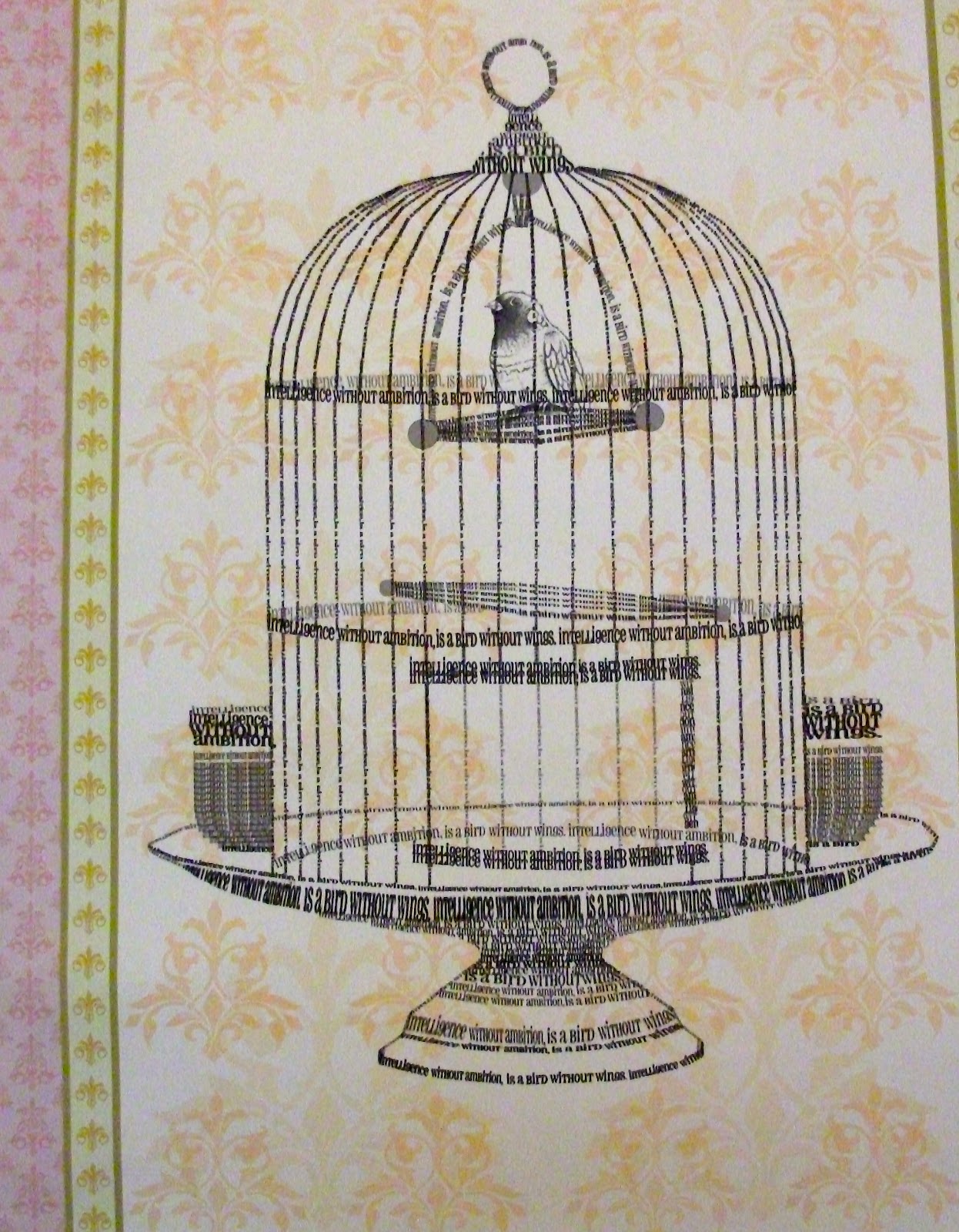
As I was playing around with inspiration and typography, I came across a quote by Salvador Dali 'Intelligence without ambition, is a bird without wings'. Initially I started by creating my own type for this quote, then one sketch of a bird, lead to a sketch of a birdcage, to the point where in order to relate the project back to typography, I decided to make the birdcage itself out of the Salvador Dali quote. I created this image by scanning in the best type of the quote, and then duplicating and arranging the layers to create a birdcage in Photoshop. This piece is on plain brown postage paper, however I decided to add to the background by screen printing vintage floral patterns and repeating them alongside each other to create my own wallpaper. 

This is the main focus of the final piece - 


This image is slightly blurred because of my camera, which I had to resort to because the image saved is too big to upload and it won't save on my mac at a smaller resolution. I found due to duplicating the layers and changing the shape of them, the birdcage seems pixelated. If I was to do this project again, I'd aim to make my final piece as hand-made as I could, but at the time of this project, I thought a Photoshop, digital image would be more successful. 


Thursday, 1 December 2011

Issues And Beliefs

The aim of this brief was to choose our own campaign by researching social, political and environmental issues that already exist and addressing one that we personally feel strongly about.

I decided to choose binge drinking to focus my campaign on, even though it's already been done in various ways before. With being surrounded by a student orientated town with a lot of bars offering the same '2 for 1' drinks, I thought I could create a contemporary campaign to target a younger audience.

After numerous sketches and playing around with the idea of drinking glasses, I found that developing a shot glass idea was probably the best way to go, in reference to all the 'free shot' stickers that are handed out around town.

The final composition was to create 3 image based solutions in an appropriate format;


All in poster format; The composition of each poster is to represent an opticians chart, with the usual lettering being replaced by shots, each poster describing a different characteristic of binge drinking. The writing on each poster is to represent the hours of a night out and the destruction of particular things as the night progresses. The type also relates to what the image is describing. The colour spills in each background are to represent spillages of drinks during a night out/party. I chose particular colours to refer to the colours of alcohol available today eg. apple sours. 

Poster 1; Eyesight
- The shot glasses in this poster are to describe the affects alcohol has on your vision. The shot glasses become faded and harder to see as the night progresses to 3am, to represent how blurred your vision goes as a result of drinking. 

Poster 2; Balance
- The shot glasses in this poster are to describe the affects alcohol has on your balance. As the shot glasses move down the poster they become multiplied and 'off-balance' to represent what happens to the stability of a person after drinking.

Poster 3; Consequences
- The shot glasses in this poster are to represent the destruction of a night out and the consequences drinkers have to face, whether it relates to losing money, breaking relationships, violence and disorderly behaviour. The broken shot glasses represent the later on in the night, the more alcohol as an affect to deliver consequences.

I enjoyed this project, literally because I made it my own, after numerous sketches and ideas I'm happy to have developed this one in particular. I took a step out of my comfort zone by becoming more 'accidental' in my backgrounds however if I was to develop my final pieces, I would create them in a more hand-made process, rather than created and then scanned in and pieced together. 


Monday, 10 October 2011

Preston Vintage & Craft Fair!

Hi all!

So I took some time out yesterday to visit the Preston Vintage & Craft Fair which my friend invited me too!   After endless trekking around an unfamiliar part of Preston, we finally came to the Continental pub, situated on South Meadow Lane. I think we all shared the same thought when we arrived.. we all felt slightly lost, there wasn't much directional help, so only after asking numerous people we found a small room at the back of a pub full of vintage and retro homewares! 


I have to say, despite the minor detours to actually find the venue and the confusion when we arrived, the experience paid off! The fair itself consisted of about 14 small stalls full of antiques, vintage and independently designed clothing, handmade jewellery, arts and crafts and my favourite part.. cupcakes! Everything was rare, quirky, affordable and antique! In such a friendly atmosphere, it really added to my day and I'm looking forward to the next fair!


I decided to take some photographs to share with you and give you a taste and here they are..


Not to mention.. my quirky friend Danielle who was right at home!


For anyone whose interested.. 

The Continental Pub holds regular fairs and their website is updated with what's on and when..

The organisers for the Vintage & Craft Fair can be found on Facebook by joining the group.. Not Just Vintage.. Uk.

Happy browsing! (:

Friday, 7 October 2011


“Being the richest man in the cemetery doesn’t matter to me … Going to bed at night saying we’ve done something wonderful… that’s what matters to me.”
- Steve Jobs.

Friday, 16 September 2011

Long time, no blog!

So, the 10th of August was quite a while ago, so I thought my blog has been neglected enough and at least deserves a mini update of what's happening!


So.. the most exciting news at the minute, I am now blogging using my very own MacBook Pro. I've finally been converted and all the saving up as really paid off, money well spent!


I start my Second Year at Uclan officially on tuesday, I'm rather excited to get back into the swing of things, there's only so much time I can have off then safe to say, I do miss my projects. 


Final news.. Currently working on a side project. A lovely lady in Huddersfield has been told about myself, and my work by a friend and she's requested I paint some sketches for her, to be displayed in her Spa. At the moment, I have two sketches drawn out, I need to introduce some watercolour and get the process rolling! And when I've finished, I'll make sure my blog is updated! 


Cup of tea at the ready..
Here's to a productive day!
...
♥